
If you have an online shop, your product pages have to work hard to turn browsers into buyers. Alex O'Byrne of We Make Websites shares his top tips to improve your page designs and boost sales
The importance of the product page on any ecommerce website can't be overestimated. This is the point at which a person moves from interested visitor to prospective customer and where the final buying decision is made; so it's vital that your product pages aren't losing potential sales.
Here are ten ways to improve the performance of your product pages.
1. Make the page more visible on Google
Making the page rank well on Google will improve your results. However, increasingly I tell clients not to worry too much about SEO. If you produce good content that gets shared, or have a notable brand, Google will notice.
Google's algorithms are now smart enough to reward people that produce good content and run helpful websites, without them needing to do too much optimisation. The technical part of SEO is as simple as making sure your website is fast and easy to use, including on mobile.
The most important thing in SEO has always been how "authoritative" your domain is. How many people link to you or mention you on their websites or on social media? And that comes down to good old-fashioned PR and getting influencers to talk about you.
Moz has produced this handy graphic, highlighting the most important elements of SEO to help you optimise your product pages.
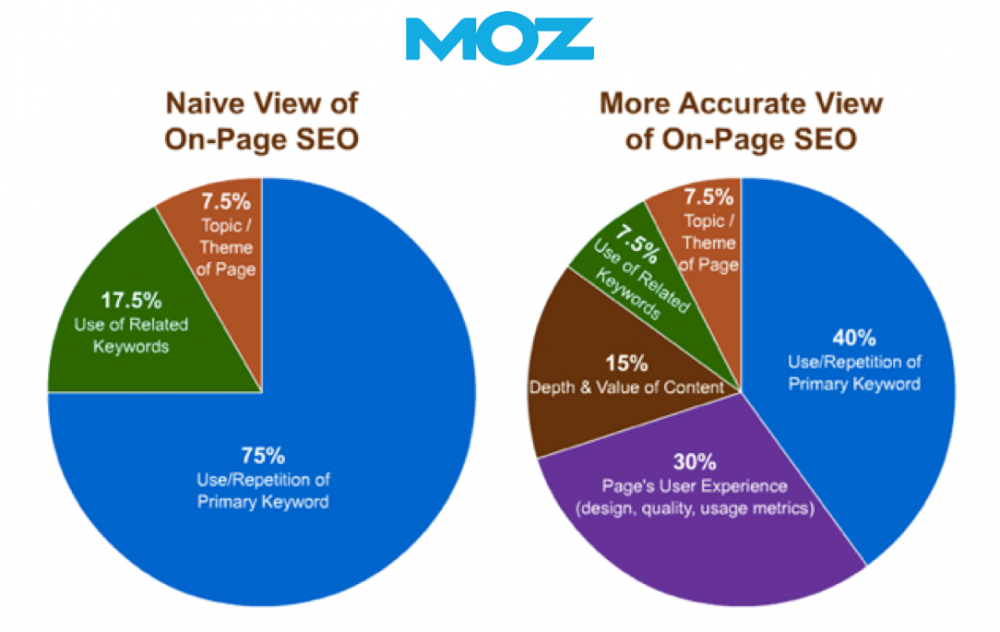
The key elements to focus on are:
- Keyword usage: remember that Google also recognises synonyms, which means you just have to write well when you describe your product. In short, write well for humans and this will do the trick;
- User experience: this means an easy-to-use page on all devices;
- Depth and value of content: again this means writing quality descriptions.
Finally, don't forget to provide 160-character meta descriptions as this is what people will see in search engine results pages (SERPs). The percentage of people that choose to click through on your result is the Click Through Rate (CTR).
This search engine result snippet is absolutely crucial; it could give you an edge over rivals, increase your CTR and boost your sales. If you don't provide a meta description, Google usually uses the first paragraph on the product page - but this may not convey key information.
2. Make sure you're ready in mobile
I'm sure I don't have to say this but if you haven't yet optimised your website for mobile, read these facts:
- more than 50% of your website traffic is probably from mobile and tablets;
- UK consumers buy more through their mobile phones than any other country, according to RetailMeNot;
- this growth is set to continue with £15bn estimated to be spent on mobile this year according to eMarketer;
- luxury fashion retailer Net-a-Porter has estimated that 41% of its orders are from mobile devices;
- the transaction rates may be lower in other sectors but even if consumers buy elsewhere, they still conduct online research via mobile.
Responsive design is the best way to make your website compatible with mobile devices. It means that the website optimises automatically for any screen size.
All the websites we build have been responsive for years now, but we still see some retailers - even big ones - not performing this basic step and missing out on sales. And having a website that isn't mobile-friendly is also bad for SEO - Google prioritises mobile-optimised pages in its SERPs.
3. Use excellent photography
Photographs sell products by helping shoppers to imagine what it will be like to own the product. Good photography shows the item in detail, it's consistent and, above all, it is inspirational.
It's often best to do your own photography; the manufacturer's photography is not always up to scratch. Ideally your product pages should use both model and pack photographs of the product.
When size is important, show something in the shot that provides context. For instance, Bellroy shows UK bank notes inside its slim wallets.
If you are selling one-of-a-kind items or used products, you must use a photograph of the actual item so that buyers can see what they are getting.
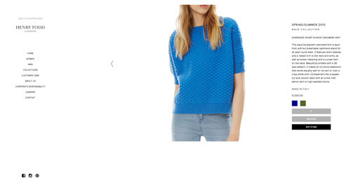
A popular trend is to use full bleed images that show the model set against a background that becomes the background for the whole page as in this example from Ayr:
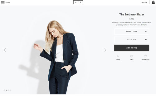
4. Write evocative and thorough product descriptions
Product descriptions are absolutely key; they should be descriptive, detailed and as inspirational as the photography. They should also answer the most common questions people might have when purchasing, such as:
- What is it made of and how is it made?
- Why was it made or why do you stock this item; what does it mean to you; what could it mean to the buyer?
- What are its limitations?
- What can it be used for?
- When will the item be dispatched?
- What is the packaging like?
- What are the care instructions?
- Is there a warranty?
- What is your returns policy?
With that said, it's also important that the product page inspires the buyer with a description of the item that goes beyond its technical specification.
5. Highlight the price and buy button
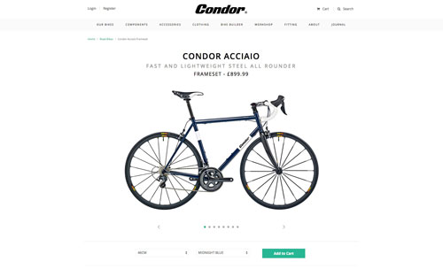
The buy button needs to be the most obvious thing on the page, near the top, just below the price, which should be just below the product title. This is convention, so users are used to it.
Whatever the layout, you should always make sure that the buy button is the clearest call to action. This layout from Condor Cycles is a good example:
I like to include a single sentence in small text directly beneath the buy button that mentions key selling point such as free shipping, two-year guarantees or speedy delivery. This gives the buyer a final bit of encouragement and trust before clicking to buy.
6. Include delivery, returns and refund information
It is absolutely essential to show information on delivery, returns and refund information on the product page. This can be summarised to save space (but always include links to a comprehensive information page) or you can use tabs or an accordion layout.
7. Show availability
To stop customers becoming frustrated, it's important to show stock availability as early as possible. For the product pages, this means making it obvious which variants are available. If you don't do this you risk annoying customers who have to click through several options to choose a size before finding it is out of stock.
8. Show scarcity
It's both useful and persuasive to show visitors if you are running low on stock for a particular item. Set a threshold and show a warning once inventory falls beneath that level to say something like: "only three remaining". This is a great way to encourage customers to buy sooner rather than later (or never).
Another good tip is to make sure that somewhere on your site there is a counter that shows the cut off for same day dispatch or next day delivery. This also instils urgency.
9. Offer social proof
Unless you're a household name, people are going to need a bit of reassurance before buying from you. The best way to do this is with "social proof". Some examples are:
- Recent press. Use the logos only, don't show a full photograph of the page.
- A big social following. If you have a large Instagram following, show this.
- Other customers using your stuff on Instagram.
- Spotted… celebrities using or wearing your stuff.
- A formal and automated review system like Yotpo or Trustpilot.
- Good old-fashioned customer testimonials.
Typically we include this element further down the page, after the product images and description. It reassures the customer once they feel they've found the right item and leaves no obstacle to buying.
10. Show related products
There is a chance that this isn't the right item, in which case you need to ensure there are other products for the customer to explore. Do this by showing related products at the end of the product page, as in this example from Katherine Hooker:
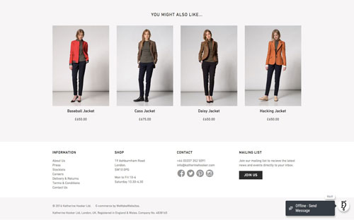
Here are some good ways to select related products:
- "other customers also liked…";
- complementary products and opportunities for upselling;
- other items in this range.
You can either manually curate the suggestions or use automation to flag up products based on customers' previous buying behaviour.
Never leave the visitor at a dead end. You'll find your website engagement increases if you offer suitable recommendations at the end of your product pages. This will help will the customer find what they're after and may also increase your Average Order Value (AOV).
Final considerations
Here are a few more ideas that are well worth trying:
- add a wishlist feature to your website so customers can save items for later;
- build a wedding registry function if that is appropriate;
- show the product SKU number if wholesalers are likely to browse your website.
The product page is a crucial part of the customer purchase process and will directly impact the profitability of your business, so it's important to get it right.
Written by Alex O'Byrne, co-founder of We Make Websites. Ecommerce content edited by Chloe Thomas of eCommerce MasterPlan.


